

Beyond Media Queries: The Next Evolution in Component-Based Responsive Design
Learn how CSS container queries help components adapt to their container's width for truly reusable, viewport-independent responsive design.
Learn how CSS container queries help components adapt to their container's width for truly reusable, viewport-independent responsive design.
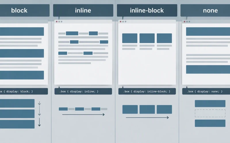
Learn how block, inline, inline-block, and none change document flow, sizing, and wrapping in CSS layout.